Every identity begins at a horizon.
New Dawn Youth and Family Centre has been shaped by horizons since 1976, by land and sea, by community, and by a shared commitment to care. What began as a local, cooperative act continues as a living, responsive organization rooted in place and responsibility. This identity is not about nostalgia. The past is present, but it is not the destination. It is prologue.
New Dawn exists in motion. Its work responds to changing social, economic, and human realities while remaining grounded in values, relationships, and community led action. Each day is understood as a beginning, an opportunity to listen, adapt, and build toward a more just and sustainable future.
At the heart of this brand is a belief in care as something made visible. Care as structure. Care as infrastructure. Care as a public good expressed through clarity, generosity, and intention. Design is not decoration here; it is a way of holding people well — in language, in systems, and in space.
These guidelines exist to protect that intention. They provide a shared framework for how New Dawn shows up in the world, visually, verbally, and emotionally, ensuring that as the organization grows and evolves, its identity remains coherent, human, and future-facing.
We want our people to look into the depths of the sea.
We want them to explore the hearts of flowers, and the hearts of their fellow people.
We want them to live, to love, to play and pray, with all their being.
Life for them shall not be in terms of merchandising but in terms of all that is good and beautiful.
They will usher in a new day by attending to the blessings of the old.
They will use what they have to secure what they have not.
We desire above all that they will discover and develop their own capacities for creation.
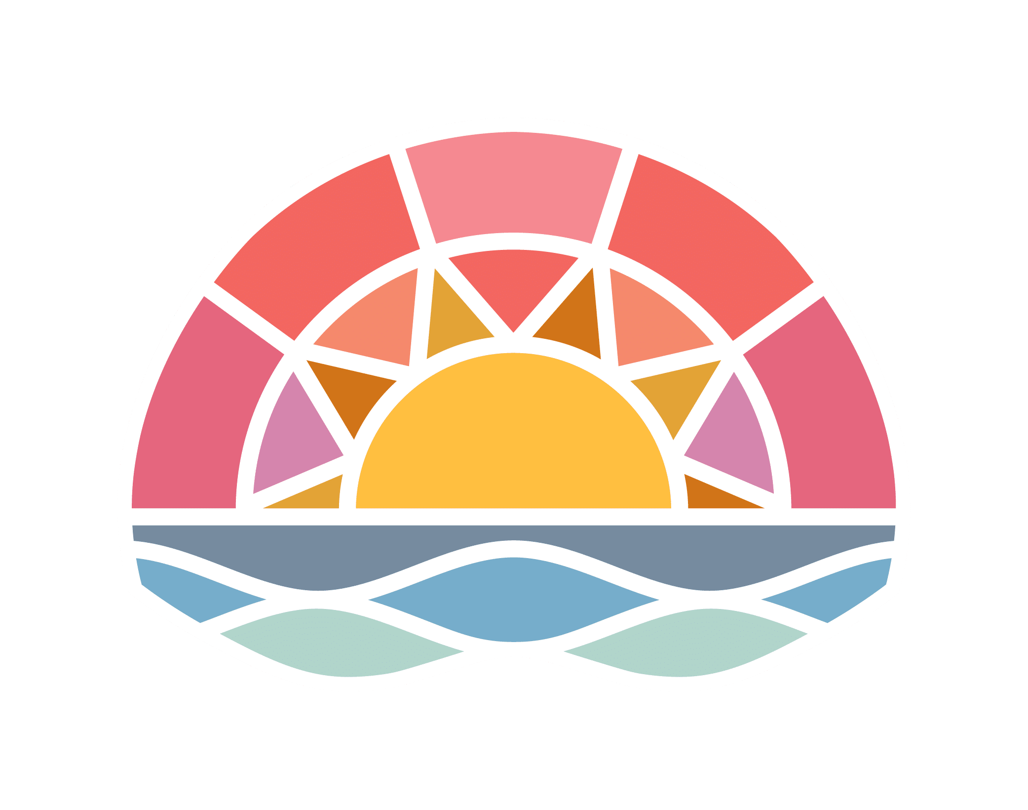
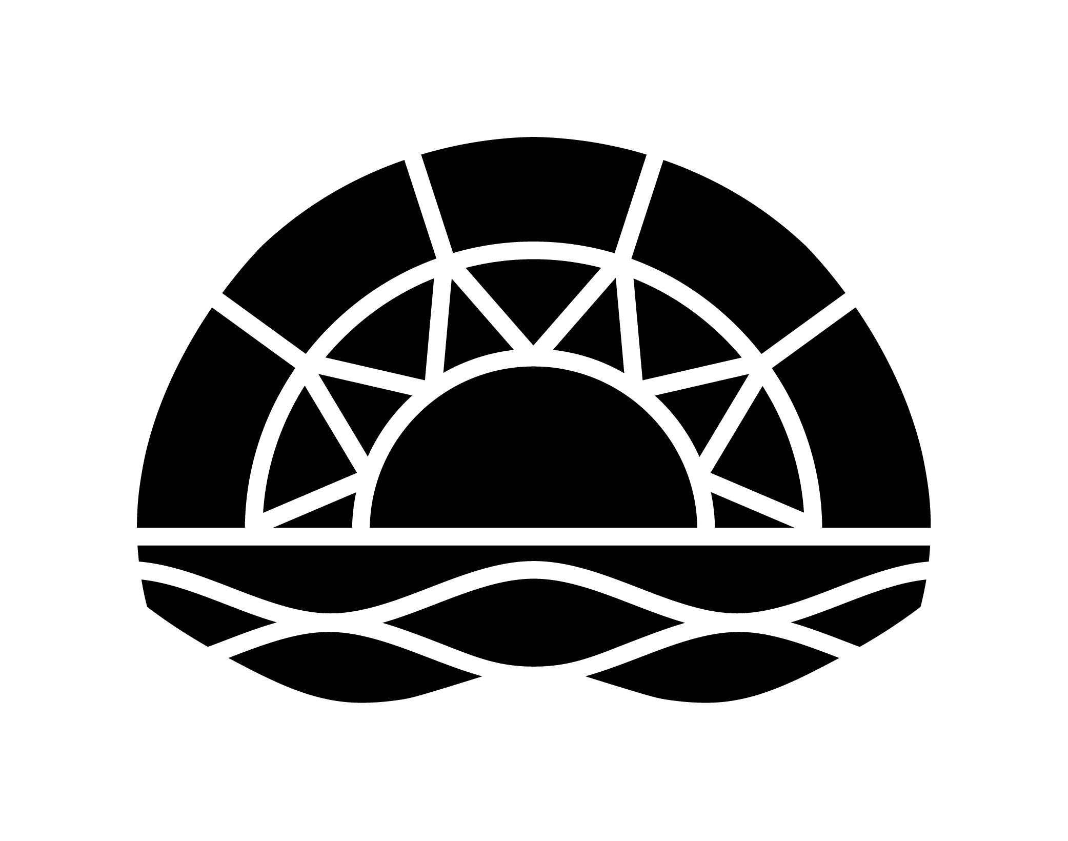
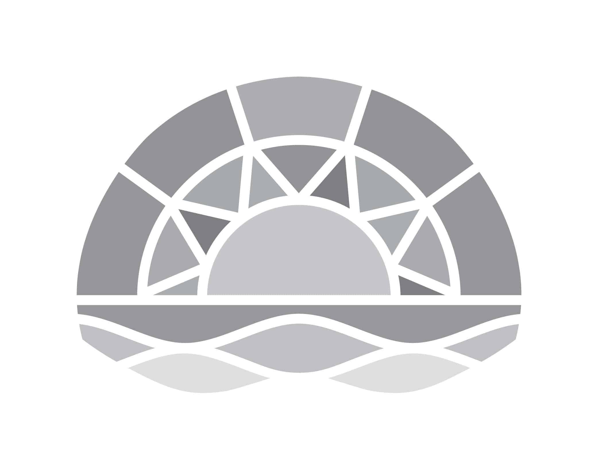
The New Dawn primary logo is intended for use on solid colour backgrounds. When placing the logo ensure it remains fully legible by avoiding background colours that compete with the brand palette. Consistent application of these guidelines preserves the recognition of the brand.
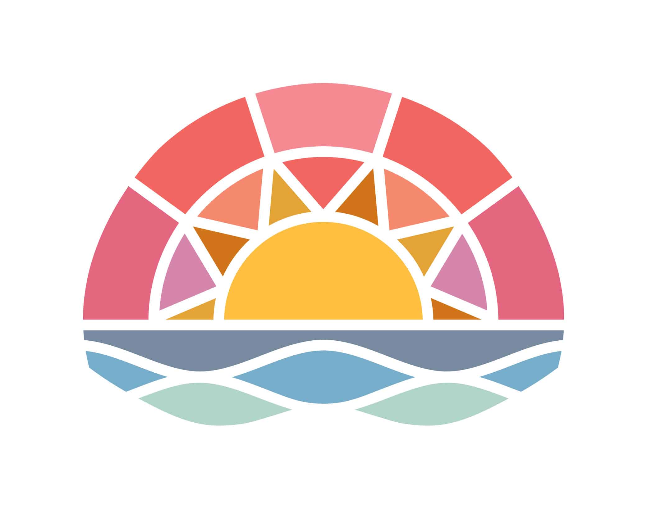
Download the full colour logo (JPEG)
Download the full colour logo (PNG)
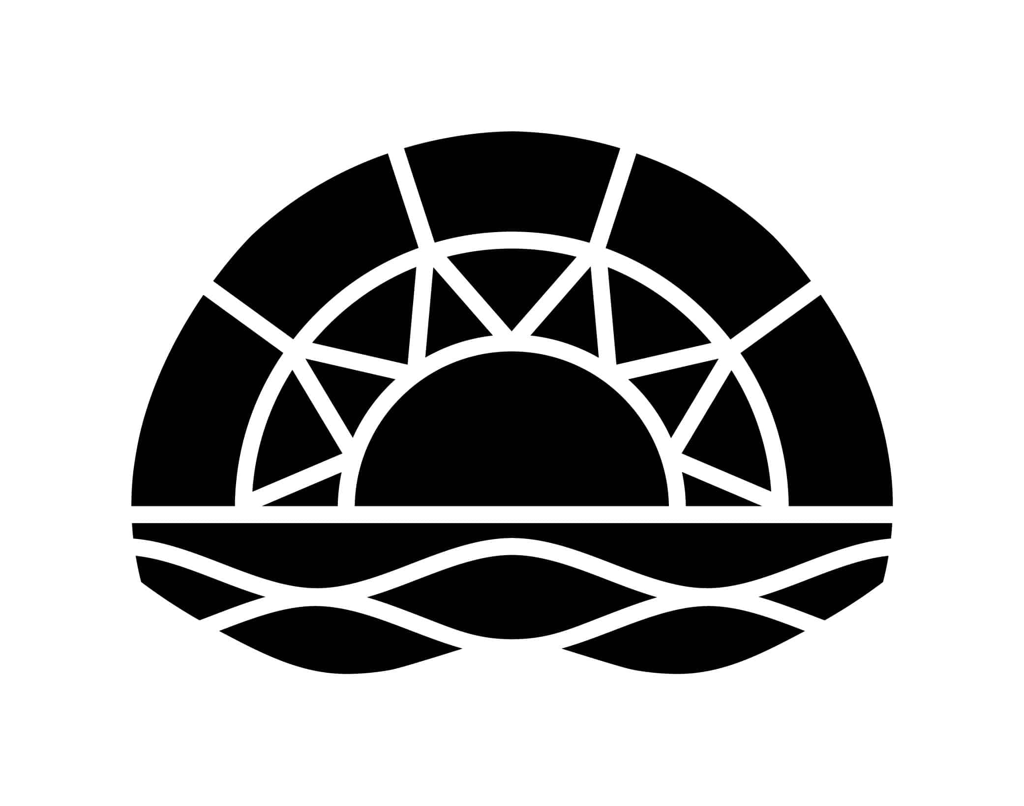
Download greyscale logo (JPEG)
New Dawn uses two typefaces — a serif and a sans serif — for print and digital. Freight Text Pro, the primary serif, offers humanistic warmth and readability. Mr Eaves XL Sans complements the serif with a clean, modern tone. Together, they honor New Dawn’s heritage while projecting a clear, forward-looking vision.